- Consumer & Web
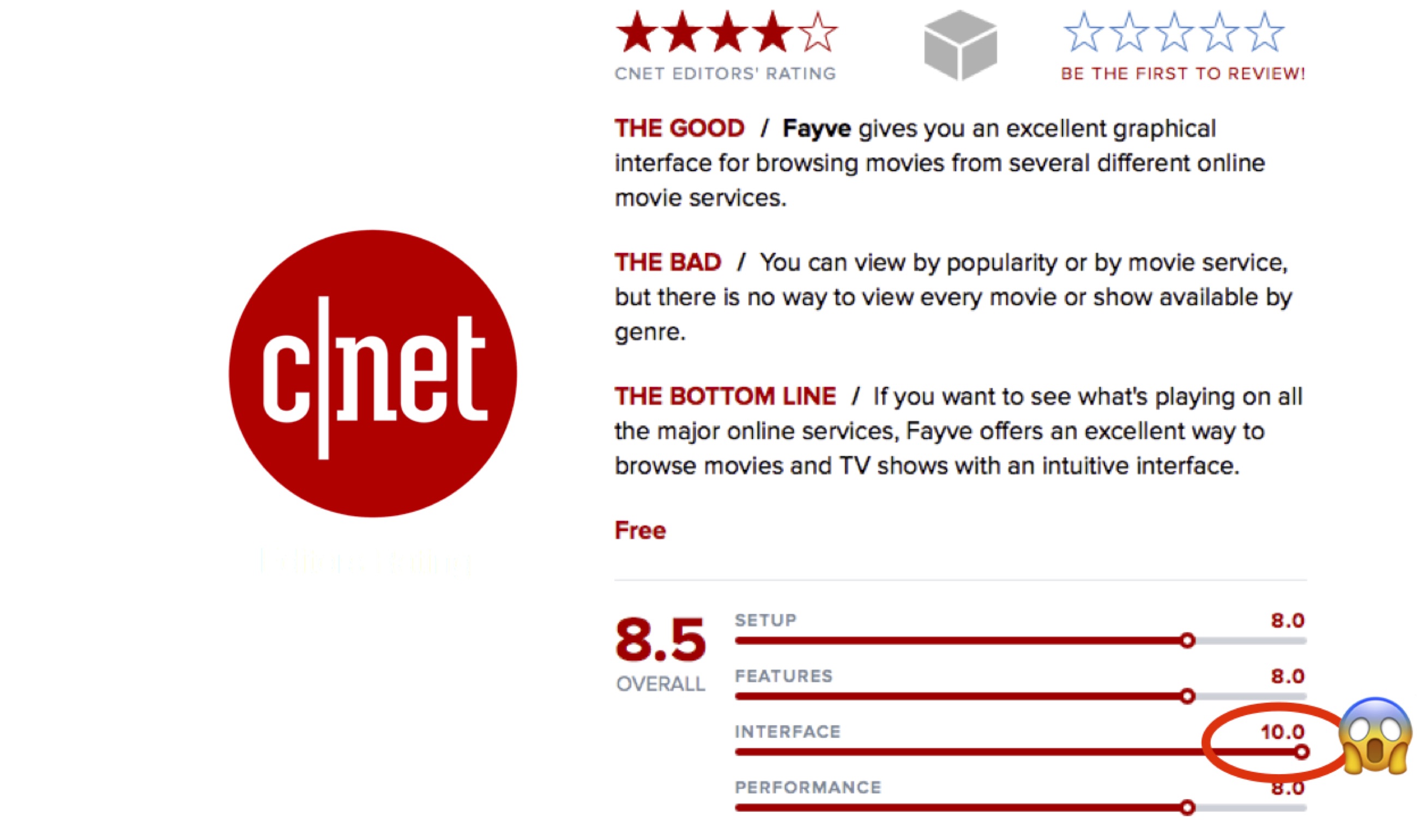
- CNET 10/10 UI score
- US Patent #9495468B2
Fayve
Browsing built like a movie palace
Read case study→
Browsing built like a movie palace
How do you find something good to watch when every service has its own walled garden?
Render-first design earned a patent
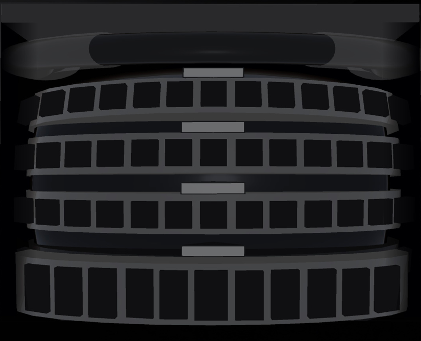
A 3D Studio Max cinematic mockup pre-dated any code and aligned the room on the carousel concept.
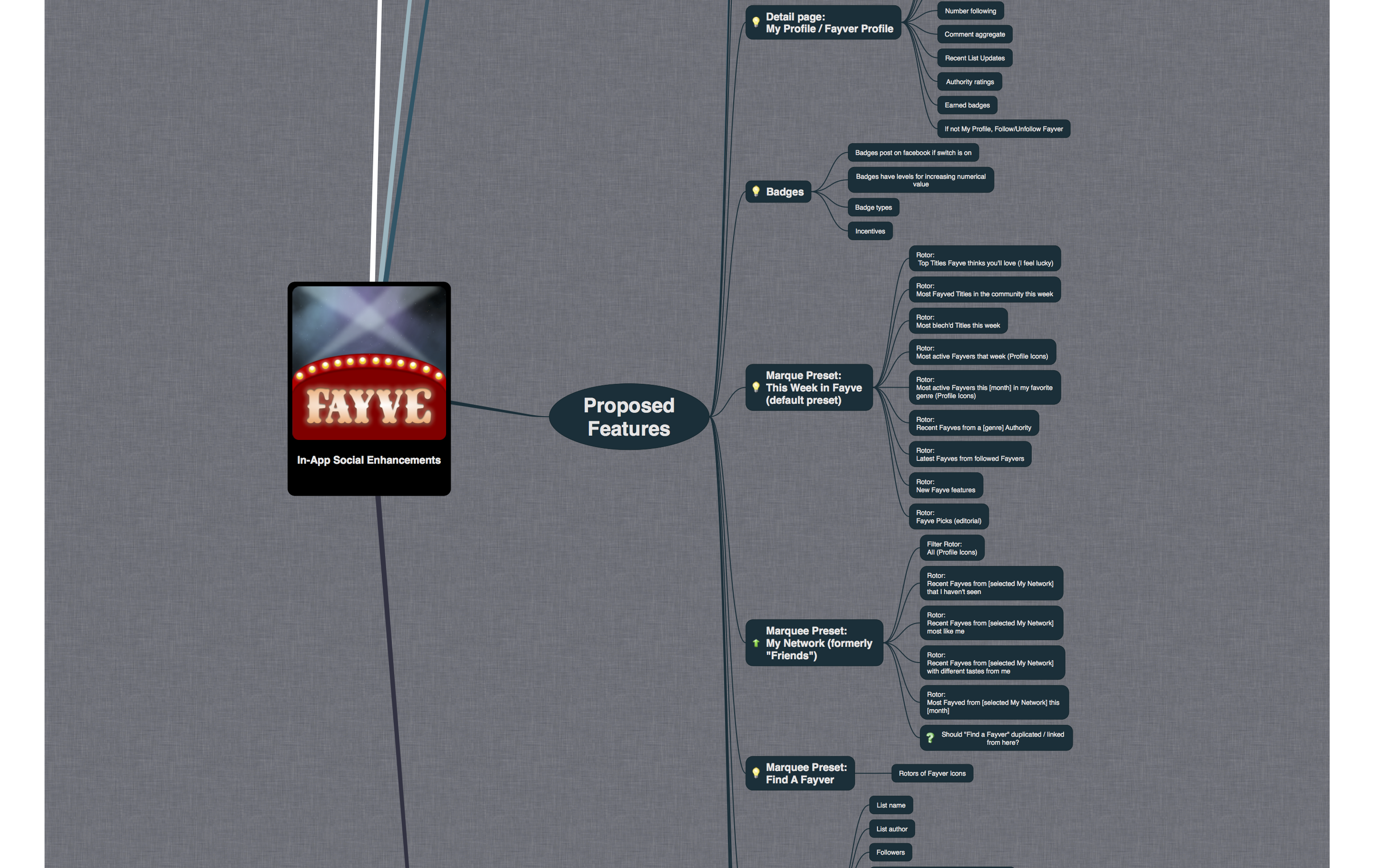
That interaction model became US Patent
CNET, Lifehacker, TWiT, The Next Web
CNET 4 stars + a 10/10 UI score, a TWiT App Cap Award, and a launch-day Lifehacker review.
Hundreds of thousands of viewers discovered films and shows in the iPad app before a partner data feed pulled the plug in 2014. The patent issued anyway in 2016.
Fayve started as a personal tool for Microsoft co-founder Paul Allen. He wanted a better way to navigate his giant collection of movies and shows, and Vulcan built it for him. The product was then taken public as an iPad app that aggregated Netflix, Hulu, Amazon, iTunes, Crackle, YouTube, and a handful of others into one place. I led every creative aspect of the project, and enjoyed the chance to flex my talents in 3D space in the waning days of the skeuomorphism movement.
Vulcan
4 internal collaborators
I ran user-journey workshops with viewers, streaming partners, engineering leadership, and Vulcan's executive sponsors. One insight ran through all of them. With so many streaming services in play, viewers weren't looking for a specific title. They were looking for something good to watch.
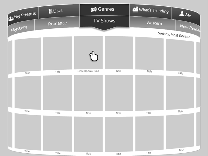
The featureset that came out built discovery around what's currently popular, what's newly arrived, what fits a mood, and which streaming service the user already paid for. Across multiple "How might we..." sessions I devised the information architecture. A multi-tier carousel (What's Hot · New Arrivals · Fayves · browsing by service), a tile-to-detail-to-destination drill-down, and a shared metadata vocabulary.
The breakthrough came from rendering the navigation in 3D Studio Max before any code was written. A cinematic mockup of stacked, rotatable, drillable tiers, each carrying data from a different streaming partner. The render aligned the room. It pre-dated wireframes. It became the substance of US Patent #9495468B2.
Working alongside the Senior Interface Designer, I produced wireframes that demonstrated how users would navigate between sections. They drove stakeholder pitches and engineering sprint reviews. Clarity first.
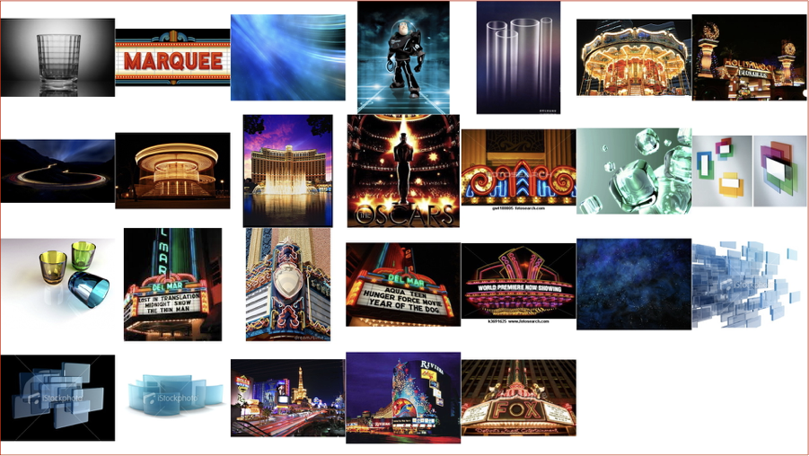
Once the interaction model was settled, I set about determining Fayve's look and feel. The project called for an old movie house aesthetic. The warmth of a single-screen cinema, marquee lighting, the texture of velvet curtains. I collected reference imagery that reflected the tone, and the through-line lands in the shipped product.
Every visual asset for Fayve passed through my hands. I designed stepped animations to articulate motion intent to engineers, including a breadcrumb transition between primary and secondary sections that made the 3D space feel inhabited rather than merely rendered.
Stepped animation for engineering. How a user pivots between primary and secondary entities.
Fayve launched November 8, 2012. Lifehacker's Melanie Pinola called it "an entertaining, almost addictive app that spins potential shows and movies in a never-ending carousel" on launch day. CNET's Jason Parker gave it a 4-star Editors' Review with a perfect 10/10 on the Interface sub-score.
"Using a multiple-tiered, rotating carousel-like 3D interface, you browse the app by rotating tiers to the selections you want, then drilling down from there… Fayve offers an excellent way to browse movies and TV shows with an intuitive interface."
Jason Parker · CNET · 2012
TWiT Network's Sarah Lane awarded the app her App Cap. The Next Web called it "a really convenient tool for movie buffs." Hundreds of thousands of viewers discovered films and shows across iPad, iPhone, and Kindle.
A streaming partner discontinued its data feed in November 2014, and Fayve was sunset after a two-year run. Two years later, US Patent #9495468B2 was issued. I'm second-named inventor on the four-inventor filing.
The patent describes a "multi-rotor-data-carousel-based graphical user interface" that "efficiently displays portions of the data items to the user." That's the conceptual model I rendered in 3D Studio Max before any code was written, now formally cited as a method for navigating large data sets.
The product had a two-year run. The craft outlasted it.
See the 20 Year Career with Vulcan chapter of the Origin Story, where Fayve sits in the broader arc of Paul Allen-era projects.